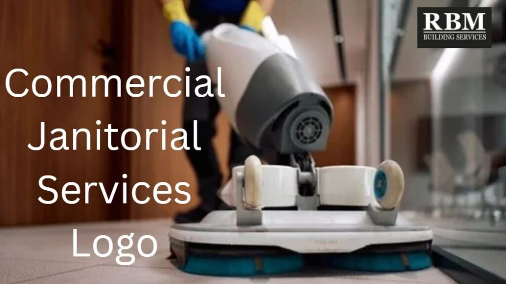
Commercial Janitorial Services Logo
A commercial janitorial services logo is the visual foundation of how a cleaning company presents itself, and it matters because clients often judge professionalism before they read a single sentence. A strong logo helps a janitorial business look trustworthy, established, and easy to remember across uniforms, vehicles, proposals, invoices, signage, and websites. The most important takeaway is that a good logo should do one job very well: make the company look clean, credible, and consistent without feeling cluttered or generic. In this article, I’ll explain what a commercial janitorial services logo is, how it works, what makes one effective, what mistakes to avoid, and how to choose the right design strategy for a cleaning brand. I’ll also cover practical branding choices such as fonts, colors, symbols, and layout, plus common questions business owners ask when they are creating or refreshing a logo. Expert guidance helps because logo design is not just about style; it is about making a company easier to trust, easier to recognize, and easier to grow.
What a Commercial Janitorial Services Logo Does
A commercial janitorial services logo is the primary visual mark used by a cleaning company that serves offices, property managers, medical facilities, schools, retail spaces, and other commercial clients. It usually appears on uniforms, service vehicles, business cards, proposals, invoices, email signatures, websites, and building signage. In simple terms, it is the face of the business. A good logo should communicate cleanliness, reliability, professionalism, and consistency at a glance.
In branding terms, the logo works with the company name, color palette, typography, and messaging to create a recognizable identity. Common logo styles include wordmarks, combination marks, pictorial marks, and badge-style logos. For cleaning companies, simplicity tends to work best because busy designs can look unprofessional or hard to read at small sizes. Design guidance from branding and logo platforms consistently emphasizes scalability, simplicity, and relevance to the service offered Tailor Brands. A logo is not the same thing as a full brand, but it is the first thing many potential customers notice. A strong commercial cleaning logo should be easy to reproduce in black and white, legible on a van, and recognizable when reduced to a tiny website favicon.
9 Things To Know
1. Simplicity wins in cleaning branding
A commercial janitorial services logo should be simple enough to understand instantly. That matters because cleaning is a trust-based service, and people generally associate cluttered design with cluttered work. A clean, minimal logo signals order, professionalism, and attention to detail. If the logo has too many shapes, symbols, or colors, it becomes harder to read on uniforms, invoices, vehicle wraps, and digital platforms.
This is why successful cleaning logos usually rely on one clear idea rather than several mixed concepts. A mop, sparkle, building silhouette, or abstract water drop can work if it is used carefully, but combining all of them at once usually weakens the message. Design advice for cleaning brands often highlights simplicity and scalability as core principles Tailor Brands. In real-world use, the simpler logo will typically be easier for customers to remember and easier for the company to apply across different materials. If a logo looks good only on a large screen and falls apart on a business card or a shirt pocket, it is not doing its job. The best commercial janitorial services logo is one that looks polished everywhere, not just in a presentation file.
2. Your logo should match your service niche
Not every cleaning company should use the same visual style. A logo for a commercial janitorial business should feel different from one for residential cleaning, carpet care, or specialty restoration. That is because commercial clients are often looking for stability, professionalism, and trustworthiness more than playfulness or charm. If the logo looks too casual, it can send the wrong message.
For example, a company that cleans office buildings may benefit from a more corporate feel, with strong typography and subtle building imagery. A company focused on healthcare facilities might lean toward a more sterile, precise aesthetic. A company that specializes in floor care may want a symbol that reflects movement, shine, or structured maintenance. BrandCrowd’s guidance on cleaning logos makes the same point: the logo should reflect the specialty rather than trying to appeal to everyone BrandCrowd video. In practical terms, this means the logo should help a prospect immediately understand what kind of cleaning business you run. If your company serves commercial accounts, the logo should not look like a residential maid service or a generic home services brand.
3. Color choice changes perception
Color is one of the fastest ways to shape how people feel about a business. In janitorial branding, blue and green are common because they suggest cleanliness, reliability, freshness, and calm. That does not mean every cleaning company must use blue or green, but those colors are popular for a reason. A commercial janitorial services logo that uses the right color palette can feel more professional and more trustworthy before the viewer even reads the company name.
The important part is not just choosing a pretty color, but choosing one that works consistently across print, embroidery, vinyl wraps, and digital use. Too many colors can make a logo look busy, while too little contrast can make it hard to read. Industry branding guidance also tends to recommend keeping color use restrained so the design remains scalable and easy to reproduce . In the real world, your logo may appear on a white van, a dark shirt, a printed bid packet, and a social media profile photo. A good color system should work in all of those places. If a logo only looks good in one background color, it is not flexible enough for a commercial service brand.
4. Typography matters more than people think
The font in a logo can communicate as much as the symbol. Sans serif fonts often feel modern, clean, and practical, which is why they are common in commercial cleaning branding. Serif fonts can feel more traditional or formal, while script fonts often create a more decorative or personal feel that may not suit a janitorial company. The wrong font choice can make a business appear less credible or harder to read.
For commercial janitorial services, legibility should be the top priority. The logo may need to appear in very small formats, on invoices, or on embroidered shirts where fine details disappear. That is why many logo design resources recommend clear, contemporary typefaces for cleaning companies. A font should also match the company’s positioning. A high-end office cleaning provider may want a more polished and refined font, while a rugged facility services company may want a stronger, more industrial look. The key is consistency: the typography should reinforce the same message as the rest of the logo. If the symbol says “clean and precise” but the font looks playful or messy, the design will feel off.
5. Symbols should be relevant, not generic
A lot of cleaning logos use bubbles, sparkles, water drops, or house icons. Some of those can work, but they are often overused. A commercial janitorial services logo should avoid looking generic unless the execution is unusually strong. The reason is simple: when a symbol is too common, the logo becomes forgettable and can look like a template. That is a problem in a crowded market where clients see many cleaning providers as interchangeable.
The better approach is to choose a symbol that connects to the business in a more specific way. For commercial services, that might mean a building outline, geometric forms, a stylized shine effect, or an abstract mark that suggests order and maintenance. Brand examples and logo inspiration collections show that strong cleaning logos often use relevant symbols without over-explaining the service. If the company name already includes a strong visual clue, the symbol can be more abstract. If the name is generic, the symbol may need to do more work. The best rule is this: the icon should support the message, not shout over it.
6. Scalability is non-negotiable
A logo must work everywhere, from a truck door to a social media avatar. That is what scalability means, and it is one of the most important practical issues in logo design. A design can look great on a computer screen and still fail badly when reduced to a tiny image or printed on fabric. This matters especially for commercial janitorial businesses because the logo will likely be used in many physical contexts, not just online.
A scalable logo should remain readable in black and white, small sizes, and fast-moving applications such as signage and vehicle graphics. If the company name disappears when the logo is shrunk, the design is too complex. If the icon loses meaning when embroidered on a shirt, it needs simplification. Cleaning logo resources consistently point to scalability as a best practice because the brand has to work across many touchpoints. In practical terms, a scalable logo saves money later because it does not need to be redesigned for each use case. It also helps the company appear consistent, which builds trust. For a janitorial brand, consistency is not a cosmetic detail; it is part of the message.
7. Consistency builds recognition
A logo becomes useful when people see it repeatedly and begin to associate it with a reliable experience. That only happens when the business uses the same visual identity across all its materials. If one truck has a blue logo, the website uses green, and the invoice uses a different icon, the brand feels disorganized. That confusion can quietly undermine credibility.
Consistency means using the same logo version, color codes, fonts, and layout rules everywhere. It also means having clear file formats for print and digital use. A good commercial janitorial services logo should be part of a mini brand system, not just a single image file. Businesses that use the logo consistently on proposals, uniforms, email signatures, and vehicle graphics tend to look more established, even if they are still growing. This is one reason brand mockups and preview tools are valuable when creating a logo. A logo should not just look nice in isolation; it should support the same identity every time a client sees it. Recognition comes from repetition, and repetition only works when the design stays stable.
8. The logo should fit your buying audience
A commercial cleaning business is usually selling to decision-makers such as property managers, office managers, facility directors, or business owners. Those buyers are not usually looking for a cute or trendy image. They are looking for a company that seems dependable, organized, and easy to work with. That is why the logo should be designed with the actual buyer in mind, not just the owner’s personal taste.
If your target clients are corporate offices, the logo should feel professional and steady. If you are targeting medical offices or schools, it should feel especially clean and controlled. If your company wants to win maintenance contracts or long-term service agreements, the brand should look like a serious operator, not a side hustle. Logo inspiration resources for cleaning companies often emphasize audience fit, because the visual message should match the customer’s expectation. A strong commercial janitorial services logo helps the buyer feel comfortable before the sales conversation even starts. That is valuable because trust is often the first hurdle in selling recurring cleaning services.
9. A logo is not a replacement for reputation
A polished logo helps a cleaning company look credible, but it cannot cover up bad service. Clients may be drawn in by the design, yet they stay for performance, responsiveness, and reliability. This is important because some businesses spend heavily on branding while neglecting the operational basics. In janitorial services, the logo should support the company’s promise, not distract from its quality.
The strongest brands use the logo as part of a larger trust system: consistent communication, professional uniforms, clear proposals, dependable schedules, and visible quality control. A logo can make a company easier to remember, but it cannot make missed visits, poor cleaning, or bad customer service disappear. In practice, that means branding should be aligned with the way the company actually works. If the business is organized, the logo should reinforce that. If the business is still building its systems, the logo should stay clean and professional rather than overly ambitious. A good commercial janitorial services logo gives the company a strong first impression, but the real brand is built through service delivery.
The Real Cost Of Poor Logo Design
A weak logo can cost a cleaning business in ways that are easy to overlook. The financial cost may show up as missed opportunities, weaker proposals, extra redesign work, or the need to reprint uniforms, business cards, vehicle wraps, and signage. Time costs appear when the company keeps revising its brand assets because the original design does not scale well or look professional in different formats. There are also relationship costs, because a logo that feels generic or amateur can make potential clients question the company’s attention to detail.
Over time, a poor logo can limit growth by making the business harder to remember and harder to differentiate from competitors. That matters in commercial cleaning, where many providers offer similar services and the brand often influences first impressions. Most of these costs are avoidable with a thoughtful design process, a clear understanding of the target client, and a willingness to keep the logo simple and flexible. The goal is not artistic complexity; it is functional professionalism.
How An Experienced Brand Expert Helps
An experienced brand or design expert helps by translating the company’s service model into a visual identity that works in the real world. That means asking who the clients are, what kind of image the business wants to project, and where the logo will actually be used. They also help with practical decisions such as font selection, icon choice, color palette, spacing, and file formats. A strong expert does not just make something attractive; they make something useful.
They also help avoid common mistakes like using too many colors, choosing trendy elements that age quickly, or designing a symbol that looks generic. Good branding guidance includes thinking about print, embroidery, signage, websites, and vehicle graphics from the start. That saves money and prevents rework later. For commercial janitorial services, the best branding support is usually the kind that keeps the design clean, trustworthy, and consistent. In other words, the expert helps the logo do its job without trying to do too much.
Logo Options And Strategies
Wordmark logo
A wordmark is a logo made primarily from the company name in a distinctive font. It works well when the business name is strong and easy to remember. The limitation is that it may be less visually distinctive if the typography is not handled well.
Combination mark
A combination mark pairs text with a symbol or icon. This is one of the most practical choices for commercial cleaning because it offers both recognition and flexibility. The downside is that it must be well balanced, or it can feel crowded.
Badge or emblem logo
A badge style logo can work for uniforms, patches, or a more traditional brand presence. It is useful when the business wants a sturdy, established feel. The drawback is that badges can become complicated if too much text or detail is added.
What To Do Now
If you are currently dealing with a weak logo, start by asking where it fails. Does it look dated, too generic, hard to read, or inconsistent across materials? Next, identify the places where the logo appears most often, such as uniforms, business cards, vehicles, proposals, and the website. Then decide whether the problem is the symbol, the font, the color palette, or the overall layout.
After that, create a simple brief for a redesign or refresh. Keep the goal focused: make the logo cleaner, more professional, and easier to use. Do not try to solve every branding issue at once. A good logo update should improve recognition and consistency without forcing a complete business overhaul. If the company is still growing, prioritize clarity and flexibility over decoration.
How To Choose The Right Designer Or Tool
Choose a designer or tool that understands commercial service branding, not just generic graphics. Look for experience with business-to-business companies, especially those that rely on trust and repeat contracts. Ask whether they provide source files, print-ready formats, and versions that work in black and white, on dark backgrounds, and at small sizes. Clear communication matters because logo design should be explained in plain English, not design jargon.
Also check responsiveness, revision process, and whether the designer thinks about real-world use. A good provider should understand uniforms, trucks, bid packets, and websites, not just mockups. For a commercial janitorial services logo, the best choice is usually the one that balances professional design with practical usability. A pretty logo is not enough if it fails on the materials that matter most to the business.
Common Mistakes
- Using too many design elements, which makes the logo hard to read.
- Choosing a symbol that is too generic, which makes the brand forgettable.
- Picking fonts that look decorative but are hard to read at small sizes.
- Overusing colors, which can make the logo look busy and inconsistent.
- Designing for personal taste instead of the actual customer.
- Forgetting to test the logo on uniforms, vehicles, and print materials.
- Ignoring black-and-white use cases.
- Treating the logo as a complete brand strategy instead of one part of it.
Frequently Asked Questions
What is a commercial janitorial services logo?
It is the main visual symbol or wordmark used by a cleaning company that serves commercial clients.
Why does a logo matter for a cleaning business?
It helps the company look professional, recognizable, and trustworthy.
What colors work best for cleaning logos?
Blue and green are common because they suggest cleanliness and reliability, but other colors can work if used well.
Should a janitorial logo include a mop or bucket?
Not necessarily. Those symbols can feel generic if overused.
What is the best type of logo for a commercial cleaning company?
A combination mark is often a strong choice because it includes both the name and a symbol.
Should the logo look formal or playful?
For commercial cleaning, formal or polished usually works better than playful.
How many colors should the logo use?
Usually a small, controlled palette works best so the logo remains easy to reproduce.
Should the logo be simple?
Yes. Simplicity makes the logo easier to recognize and use across many formats.
What font style is best?
Clean, readable sans serif fonts often work well for commercial cleaning brands.
Why does scalability matter?
Because the logo needs to work on everything from business cards to vehicle wraps.
Can I use a free logo template?
Yes, but it is important to make sure it still looks unique and professional.
What makes a logo look cheap?
Too many details, weak typography, poor spacing, and generic symbols often create that effect.
Should the logo reflect my exact services?
It should reflect the general type of business and the feeling you want clients to have.
Is a symbol necessary?
Not always, but it often helps with recognition and brand recall.
Can a logo help me win commercial contracts?
It can help create a strong first impression, but it cannot replace good service and trust.
Should the logo look the same on everything?
Yes, consistency is important for recognition and credibility.
Do I need different versions for print and digital?
Yes. A good brand usually has multiple file formats and layout variations.
Can I change my logo later?
Yes, but frequent changes can confuse customers, so updates should be intentional.
What should I avoid in a cleaning logo?
Overly complex graphics, unreadable fonts, and too many colors.
Do commercial clients care about the logo?
They care more about service, but the logo influences first impressions.
Should the logo look modern?
Usually yes, as long as it still feels stable and professional.
How do I know if the logo works?
Test it at small sizes and on real-world materials like uniforms and proposals.
Is a dark logo okay?
Yes, if it still reproduces clearly in different settings.
Can I use abstract shapes instead of cleaning icons?
Yes. Abstract marks can work well if they feel professional and memorable.
What is the biggest logo mistake for janitorial companies?
Trying to include too much information in one design.
Rules And Standards To Know
There are no special laws that govern logo style itself, but there are practical standards that matter in business use. A logo should be easy to reproduce consistently across print and digital media, and it should not infringe on someone else’s trademark or brand identity. That is why businesses should be careful when choosing symbols, names, and colors that are too close to a competitor’s look. In commercial service branding, the main “standard” is usability: the logo should work on uniforms, trucks, paperwork, websites, and signage without losing clarity. The most useful branding advice from logo and design platforms is to keep the mark simple, scalable, and relevant to the service.
Conclusion
A commercial janitorial services logo is more than decoration. It is a practical business tool that helps a cleaning company look trustworthy, organized, and memorable across every client touchpoint. The best logos are usually simple, readable, scalable, and aligned with the type of customers the company wants to serve. Most logo problems come from trying to do too much, using generic symbols, or designing for personal taste instead of commercial buyers. Those problems are avoidable with a clear plan and a focus on how the logo will actually be used. If you are building or refreshing a cleaning brand, the smart move is to keep the design clean, professional, and consistent. For guidance related to commercial janitorial services logo strategy, consult with RBM Services.