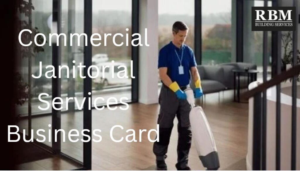
Commercial Janitorial Services Business Card
A commercial janitorial services business card is a small but powerful marketing tool that helps cleaning companies look professional, memorable, and easy to contact. For commercial clients, the card often serves as the first proof that your business is organized and trustworthy, so the design matters more than many owners realize. The most important takeaway is that a good card should do two things at once: communicate your brand clearly and make it effortless for a prospect to take the next step. In this article, I’ll explain what belongs on a janitorial business card, what commonly goes wrong, how design choices affect credibility, and how to create a card that supports real sales instead of just looking nice. We’ll also cover practical strategies for layout, copy, paper stock, and distribution, along with answers to the questions cleaning business owners ask most often. Expert guidance helps because business cards are not just print pieces; they are part of your sales process, and poor choices can quietly cost you leads.
What a Commercial Janitorial Services Business Card Does
A commercial janitorial services business card is a compact brand and contact tool used by cleaning companies that serve offices, property managers, schools, medical facilities, and other businesses. It usually includes the company name, person’s name, job title, phone number, email, website, and sometimes a tagline or QR code. In practice, the card is meant to create a quick, professional impression and make follow-up easy. A good card should help a prospect remember your business, understand what you do, and know exactly how to reach you.
For commercial cleaning companies, the card also acts as a credibility signal. If your card looks cluttered, dated, or hard to read, a prospect may assume your operations are the same way. That is why design guidance for cleaning-service business cards emphasizes clarity, relevant branding, and avoiding unnecessary clutter. In many cases, the card is handed out during walkthroughs, networking meetings, property visits, or referrals. It is not a brochure, and it is not a mini website; it is a fast, high-trust introduction. The best commercial janitorial services business card makes your company easy to remember and easy to contact without crowding the surface with too much information.
9 Things To Know
1. Your card should be built around a clear purpose
A janitorial business card is not just a place to put your contact details. Its job is to help the recipient remember your company and contact you later without friction. That means every element on the card should support one of two goals: brand recognition or lead generation. If something does not help with either goal, it probably does not belong on the card.
This matters because business cards have limited space. If you try to include too much text, too many icons, or too many services, the card becomes hard to read and less effective. The strongest commercial cleaning business cards usually keep the front focused on branding and the back focused on contact information, or vice versa. That approach prevents clutter and gives the card a cleaner look. In real-world use, a prospect should be able to glance at the card, understand who you are, and know how to reach you. If the recipient has to search for the phone number or squint to find the company name, the card has already failed. A simple, purposeful layout almost always performs better than a busy one.
2. Include only the information that helps you win work
The most effective commercial janitorial services business card includes the essentials: company name, your name, title, phone number, email, website, and logo. Some companies also include a QR code or a short tagline. Beyond that, anything extra should be carefully justified. The goal is not to fill the space; it is to make sure the card helps a prospect take the next step.
This is important because too much information creates hesitation. A card packed with multiple phone numbers, social icons, slogans, and service lists can feel noisy rather than professional. Cleaning business marketing guidance consistently stresses essential information first, with a clear call to action second. If you are a commercial cleaning provider, prioritize the contact method your clients actually use. If calls matter most, make the phone number prominent. If emails or estimates matter more, make those easy to find. The best cards reduce effort for the customer. They do not make people work to figure out how to contact you.
3. Design should match the commercial cleaning audience
The look of a business card should fit the clients you want to attract. A commercial janitorial business usually sells to office managers, property managers, facility directors, and business owners. Those buyers are often looking for professionalism, reliability, and consistency, not cute graphics or overly playful branding. If the card feels too casual, it can send the wrong message about the company.
That is why many cleaning business card examples use restrained colors, clean fonts, and simple layouts. For commercial work, blue, white, gray, and green often work well because they suggest cleanliness and trust. That does not mean every cleaning card must look the same, but it does mean the design should feel dependable rather than decorative. If you want to win recurring janitorial contracts, the card should visually support the idea that your business is organized and capable. The best card for a commercial cleaning company is usually the one that feels polished, practical, and serious enough for B2B clients.
4. Readability matters more than creativity
It is tempting to make a business card stand out with unusual fonts, bright colors, or dramatic layouts. But for commercial janitorial services, readability almost always matters more than creativity. A prospect should be able to pick up the card and understand it in a second or two. If the text is too small, the font is too decorative, or the contrast is too weak, the card becomes frustrating instead of useful.
This is especially important because many cards are read in bad lighting, glanced at quickly, or stored and revisited later. Practical design advice for cleaning business cards repeatedly warns against thin text and cluttered layouts. In the real world, a busy property manager or office administrator may be reviewing several vendors at once. If your card is harder to read than the others, it may be ignored. The safest approach is to use strong contrast, simple font pairings, and enough white space to let the information breathe. Creativity can help, but only after clarity is protected.
5. One side should often do less, not more
A two-sided card is often smarter than a single crowded side. One side can carry the logo or brand image, while the other side can hold the contact details and message. This helps keep the card clean and makes it easier for the recipient to process the information. For commercial janitorial businesses, that balance is useful because the card has to look professional without becoming busy.
This matters because people rarely remember every detail from a card, but they do remember how easy it was to understand. A clean visual side can reinforce your brand, while a text-focused side can make follow-up simple. Cleaning-service marketing guidance recommends separating branding and contact information so neither side becomes overloaded. In practice, this makes the card feel more thoughtful and easier to use. If you are trying to win commercial accounts, a two-sided layout often gives you the best of both worlds: a stronger first impression and a cleaner contact path.
6. The card should reflect your actual service quality
A business card is small, but it still creates expectations. If the card looks polished, a prospect assumes the company is polished. If it looks cheap, flimsy, or generic, the business may seem less dependable before the first conversation even happens. That is why card quality should match the service level you want to project.
This does not mean you need expensive printing for every situation. It does mean that paper stock, finish, and print quality should feel intentional. A dull or poorly printed card can quietly undermine your brand, especially in a service business where trust and detail matter. For cleaning companies, the business card should visually say: “We pay attention.” That is one reason many cleaning-service card guides recommend avoiding cookie-cutter templates and stock-looking designs. If the card looks like everyone else’s, it does not help you stand out. If it looks professional and consistent with the rest of your brand, it becomes a useful sales asset instead of an afterthought.
7. A simple call to action can improve response
A business card works better when it tells people what to do next. That could be a line such as “Call for a free estimate,” “Schedule a site walkthrough,” or “Visit our website.” A clear next step reduces friction and makes it more likely that the card turns into a lead. Without a call to action, the recipient may simply keep the card without ever reaching out.
This is particularly useful for commercial janitorial services because many buyers need a reminder to move from interest to action. They may like your service, but they still need a reason to call. Marketing guidance for cleaning service business cards often recommends adding a short CTA or value statement. In real use, the CTA should be short and natural, not pushy. If the card is aimed at business clients, the wording should feel professional and low-pressure. For example, “Request a walkthrough” may fit commercial cleaning better than a salesy slogan. The right CTA makes the card function more like a lead generator and less like a passive handout.
8. QR codes can help, but only if they are useful
A QR code can make a commercial janitorial services business card more effective by linking to a website, quote form, portfolio, or contact page. That is helpful when you want to reduce the steps between receiving the card and taking action. But QR codes should be used carefully. If the destination page is slow, confusing, or irrelevant, the code creates a bad experience instead of a better one.
The key is usefulness. A QR code should lead to something simple, mobile-friendly, and directly related to the buying decision, such as a request form or service overview. It should not send someone to a generic homepage that forces them to hunt for the next step. In practical terms, QR codes are best when they support your main sales process, not when they replace it. Some cleaning-service card tips also suggest using QR codes as a space-saving tool when you need to keep the card uncluttered. If you use one, test it several times and make sure it still works after printing. A QR code is a convenience feature, not a substitute for a clear phone number or email address.
9. Your card should match your brand everywhere else
A business card is strongest when it matches your website, uniforms, trucks, invoices, and email signature. If all of those materials look different, the brand feels disjointed. Consistency builds trust because it signals that the company is organized and pays attention to detail. In commercial cleaning, that is not just a design issue; it is a business issue.
This matters because buyers often notice multiple touchpoints before they buy. They may see your card during a walkthrough, your website later, and your proposal after that. If the colors, logo, or tone keep changing, the brand becomes harder to remember. A clean, consistent design system makes every interaction feel more professional. Advice for cleaning-business branding frequently stresses the value of keeping visuals aligned across materials. The practical takeaway is simple: don’t treat the card as a standalone project. Treat it as part of your entire commercial janitorial brand.
The Real Cost Of A Weak Business Card
A weak business card can cost more than the price of the printing itself. The obvious cost is missed opportunities: if the card is confusing, generic, or unprofessional, a prospect may never call. There is also a time cost because owners end up reprinting cards, redesigning layouts, or explaining contact details that should have been clear from the start. In a service business, even a small first-impression problem can slow down sales conversations.
The emotional cost is real too. Owners often feel frustrated when they know their service quality is strong but their marketing materials do not reflect it. A poor card can make a capable business look less established than it really is. Over time, that can affect credibility, referrals, and the ability to compete for commercial accounts. Most of these costs are preventable with a thoughtful design, a clean layout, and a focus on usability rather than decoration. A business card should help your company look as reliable as the service it provides.
How An Experienced Expert Helps
An experienced branding or print professional helps by turning a vague idea into a card that actually works in the field. They ask what kind of clients you serve, how you generate leads, and where the card will be used. Then they shape the layout, paper choice, typography, and messaging around those realities. That is important because a card for a commercial cleaning company should support trust and lead generation, not just look attractive in a proof.
They also help avoid common mistakes such as using too many fonts, crowding the layout, or printing on stock that feels too thin or flimsy. A good expert thinks about the whole system: card, logo, website, and sales process. That matters for commercial janitorial services because the card often appears during in-person conversations, where the details need to be obvious immediately. Expert guidance saves time, reduces rework, and usually creates a stronger return on a very small piece of marketing.
Business Card Options And Strategies
Minimalist card
A minimalist card uses strong typography, plenty of white space, and only the most essential information. It works well for commercial cleaning because it feels modern and professional. The limitation is that it may feel too plain if the branding is weak.
Two-sided card
A two-sided card allows one side for branding and the other for contact information or a call to action. This is often the best all-around choice because it balances design and function. The drawback is slightly higher printing cost.
Premium-finish card
A premium card uses thicker stock, special coating, embossing, or another finishing touch. It works well when you want to project a high-end or highly professional image. The limitation is cost, and it should only be used if the rest of the branding is already strong.
What To Do Now
If your current business card is not working, start by asking what problem it is supposed to solve. Do you need more calls, better brand recognition, a more professional impression, or simpler contact information? Next, compare the card to your actual service brand. If the design feels cheap, crowded, or off-message, that is likely the issue.
Then strip the card down to the essentials. Keep the contact path clear, improve readability, and make sure the layout matches your commercial janitorial brand. If you are unsure, test the card with a few trusted people and ask them what they remember after one quick look. If they cannot tell who you are, what you do, and how to reach you, the card needs work.
How To Choose The Right Designer Or Printer
Choose a designer or printer that understands service businesses, not just general graphics. Look for someone who can explain why certain layouts, fonts, and finishes work better for commercial clients. Ask whether they provide print-ready files, digital versions, and revisions. Clear communication matters because a business card should be easy to understand, not full of design jargon.
Also consider responsiveness, proofing, and consistency with your brand. A strong provider should help you keep the card aligned with your logo, website, and other marketing materials. For a commercial janitorial services business card, the best choice is usually the one that makes your company look trustworthy and easy to contact. That is more important than flashy design.
Common Mistakes
- Putting too much information on the card, which makes it hard to read.
- Using thin or decorative fonts that disappear at small sizes.
- Choosing a busy layout that feels cluttered rather than professional.
- Printing on flimsy stock that makes the business look cheap.
- Using stock-looking graphics instead of clean branding.
- Forgetting a clear call to action.
- Making the card inconsistent with the website or uniforms.
- Ignoring the back side of the card as wasted space.
Frequently Asked Questions
What is a commercial janitorial services business card?
It is a printed card used by a commercial cleaning company to share contact information and support branding.
What information should be on the card?
At minimum, include the company name, your name, phone number, email, website, and logo.
Should I include a tagline?
Yes, if it is short and helps explain what makes the business different.
Is a QR code a good idea?
It can be, as long as it links to something useful and mobile-friendly.
Should the card be one-sided or two-sided?
Two-sided is often better because it gives you more room without clutter.
What colors work best?
Clean, professional colors such as blue, green, white, and gray are common in cleaning brands.
Should I list all of my services?
Usually no. Keep the card focused and let your website or proposal handle the details.
Can I use a free template?
Yes, but make sure it still looks professional and does not feel generic.
What paper thickness should I use?
Choose a sturdy stock that feels substantial in the hand.
Why does the card’s finish matter?
It affects how professional the business feels and how well the card holds up.
Should I use photos on the card?
Usually no. For a service card, a clean logo and clear text are often better.
What font should I use?
Simple, legible fonts are best, especially sans serif styles.
Is a very creative design a good idea?
Only if it still remains easy to read and aligned with the brand.
What is the biggest business card mistake?
Trying to fit too much onto a small surface.
Should the card match my uniforms?
Yes. Consistency helps the business look more organized and trustworthy.
How can a business card help me get clients?
It gives prospects a professional reminder of who you are and how to contact you.
Do commercial clients still use business cards?
Yes. They still matter in walkthroughs, networking, referrals, and on-site meetings.
Should I put my title on the card?
Yes. It helps clarify your role in the company.
Can I use the same card for everyone on the team?
You can, but many businesses personalize cards by role or person.
Should the card look formal?
For commercial janitorial services, yes, usually more formal than playful.
What makes a card look cheap?
Crowded text, weak paper, low-resolution graphics, and poor typography.
Is black-and-white okay?
It can be, but a little color often helps the card feel more polished.
Should I use both a phone number and email?
Yes, giving multiple contact options is usually smart.
How do I know if the card works?
Show it to a few people and ask what they remember after a quick glance.
Can I change the card later?
Yes, but it is better to get the core structure right the first time.
Rules And Standards To Know
There are no special laws that govern the style of a business card, but there are practical standards that matter. The card should be truthful, readable, and consistent with the company’s actual branding. If you use logos, fonts, or images, make sure you have the right to use them and that they do not conflict with someone else’s brand identity. In business marketing, the main standard is usability: the card should make it easy for a commercial prospect to know who you are and how to reach you. Guidance for cleaning-service cards consistently emphasizes essential contact information, clean design, and avoiding clutter.
Conclusion
A commercial janitorial services business card may be small, but it plays a big role in how your company is perceived and remembered. The strongest cards are simple, readable, consistent with the brand, and built to make follow-up easy. Most card problems come from the same mistakes: too much information, weak typography, flimsy materials, and design choices that look attractive but do not work in the real world. Those problems are avoidable with a clear plan and a focus on what the card is supposed to do. If you are creating or revising a card, prioritize professionalism, clarity, and a direct path to contact. For guidance related to commercial janitorial services business card design and strategy, consult with RBM Services.